Planning advice
How to Choose a Wedding Color Palette
The right palette is decided by the room you booked, not by a mood board. Here is how we build one.
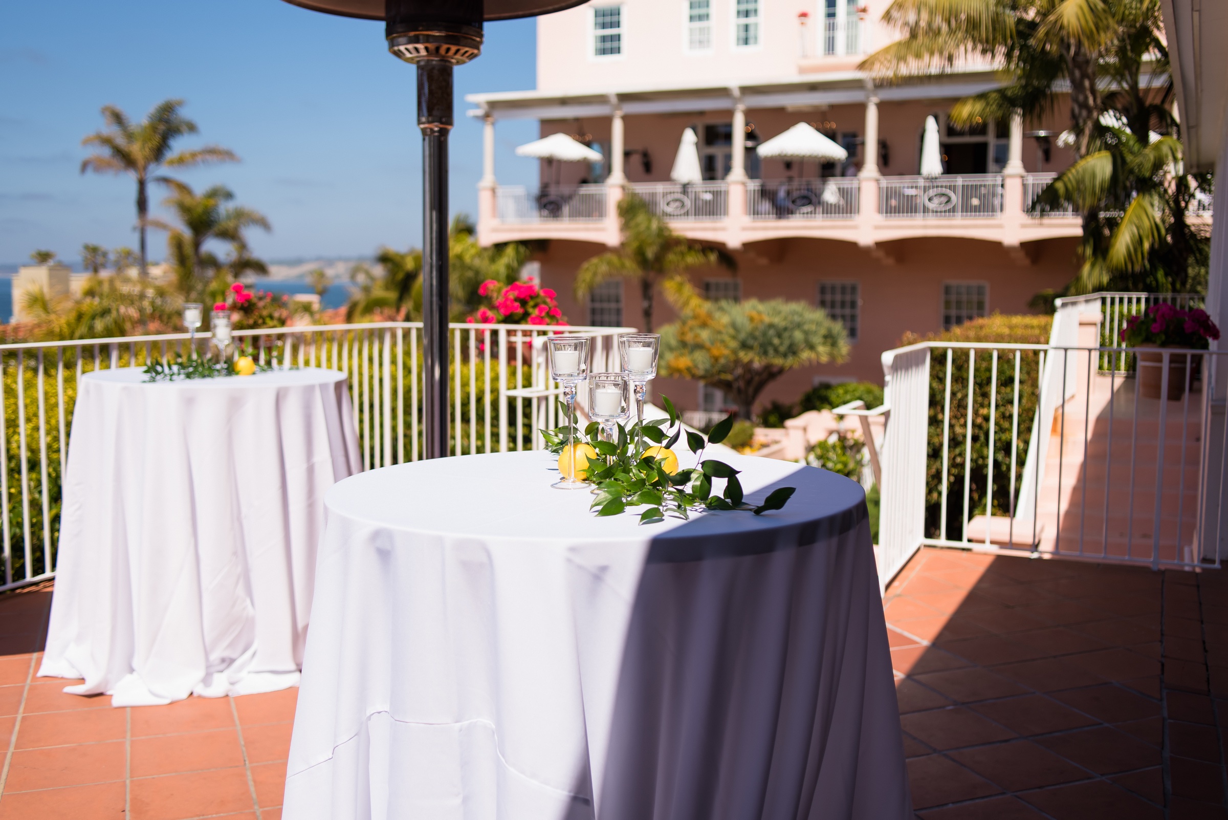
Every wedding we design starts with the same question: what does the venue already look like? A pink Spanish hotel over the ocean, a gilded downtown ballroom, a garden under palms, a lawn at a private estate. Each one has colors built in. A palette that joins that conversation looks like it grew there. A palette that interrupts it looks placed, no matter how beautiful the flowers.
No. 01
Write down what the venue gives you
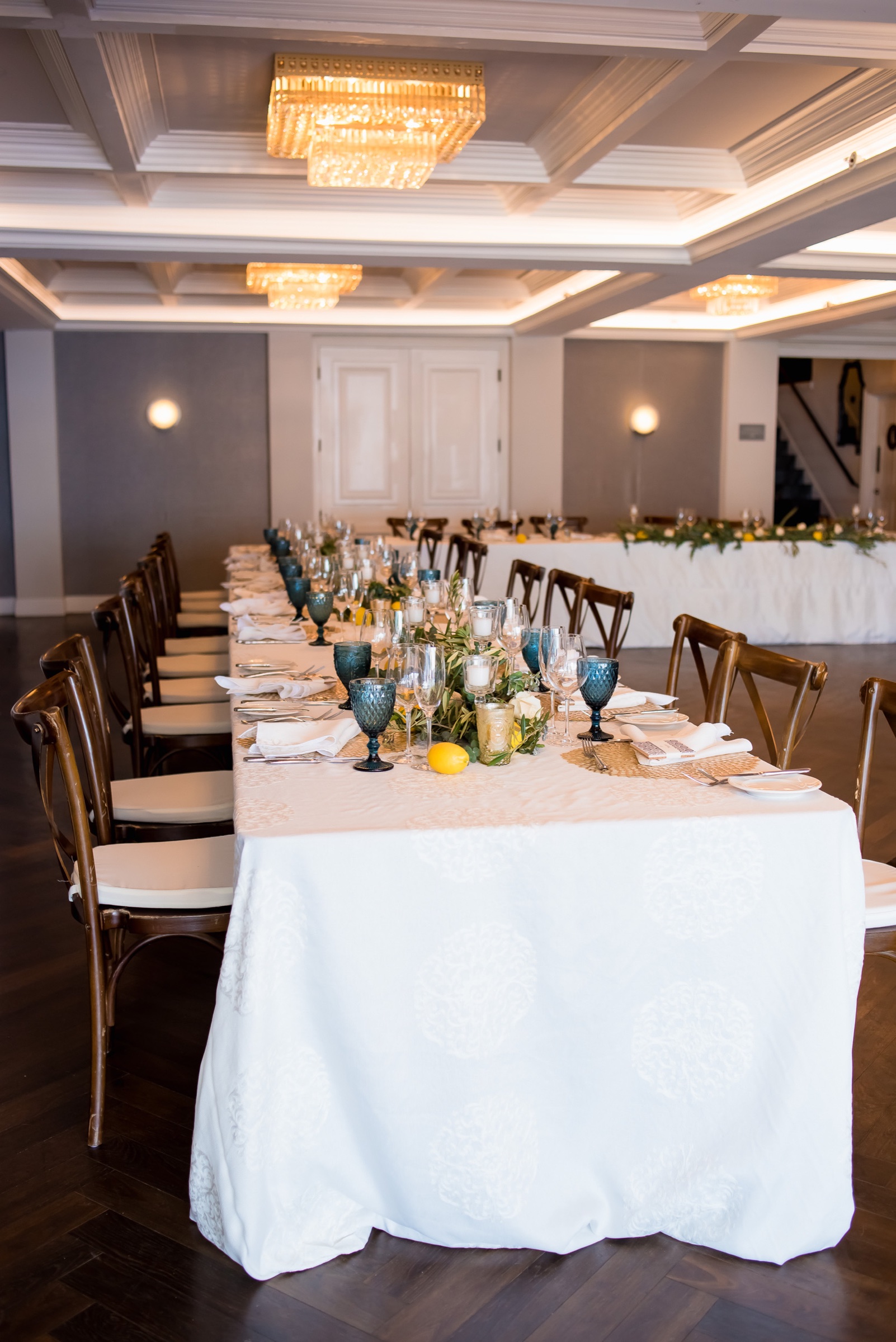
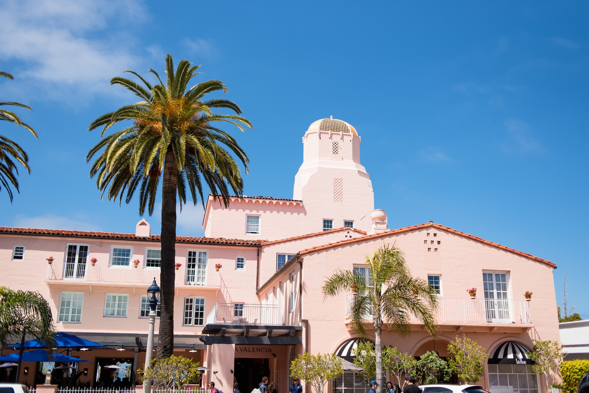
Walk the ceremony site and the reception room and note the colors you cannot change: the stucco, the carpet, the chandeliers, the floor, the wallpaper, the view. At La Valencia that list was pink stucco, a black-and-white checkered floor, crystal, and a wall of blue watercolor florals, with the Pacific a block away. The palette, greenery, blues, and cream, came straight from that list.
Do
Photograph the room in the light of your reception hour. Late-afternoon sun on a terrace is a different color from noon.
Don’t
Trust the venue’s website photographs. They are often shot with another couple’s design in place.
No. 02
Three colors and a neutral
A palette that photographs well has a lead color, a supporting color, an accent, and a neutral that carries the linens, the paper, and the gowns.
Lead
The one you would name if someone asked. Lavender, blush, deep teal, terracotta.
Supporting
A quieter neighbor of the lead. Dusty blue beside lavender; sage beside blush.
Accent
One bright note, used sparingly, so the evening never fades into the same four colors.
Neutral
Ivory, cream, taupe or champagne. Pure white is a choice, not a default.
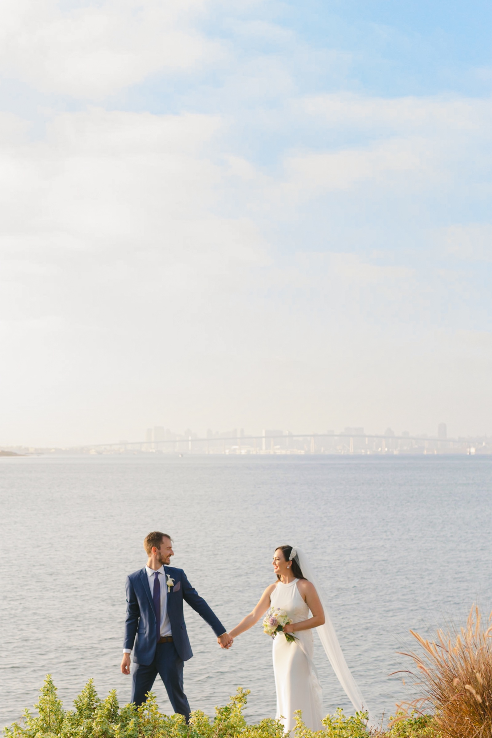
At Loews Coronado Bay a lavender and blue ceremony moved to fuchsia orchids on the reception tables for exactly that reason: after a ceremony in cool colors, one hot note at the table is what keeps the evening alive.
Don’t
Go past three colors plus a neutral. Five-color palettes read as busy in photographs and are almost impossible to source in flowers across a season.
Don’t
Default to pure white. It photographs cool and shows every mark; ask for ivory next to warm linens.
The building is pink, the sea is blue, and the florals either join that conversation or interrupt it. We joined it.
No. 03
Check it against the season and the flowers
San Diego is generous with flowers year round, but not every color is available every month at a price that makes sense. Peonies are a May and June flower. Dahlias peak late summer into fall. Blue in nature is mostly delphinium, hydrangea, and thistle. If your lead color is a flower color, ask your florist which blooms carry it in your month before you fall in love with it.
Do
Let greenery do the work of making arrangements look like they belong. Olive, eucalyptus, ruscus, and smilax carry a garden palette on their own.
Don’t
Dye flowers to hit a swatch. Dyed stems look wrong next to natural ones and bleed on linens in heat.
No. 04
Decide where each color lives
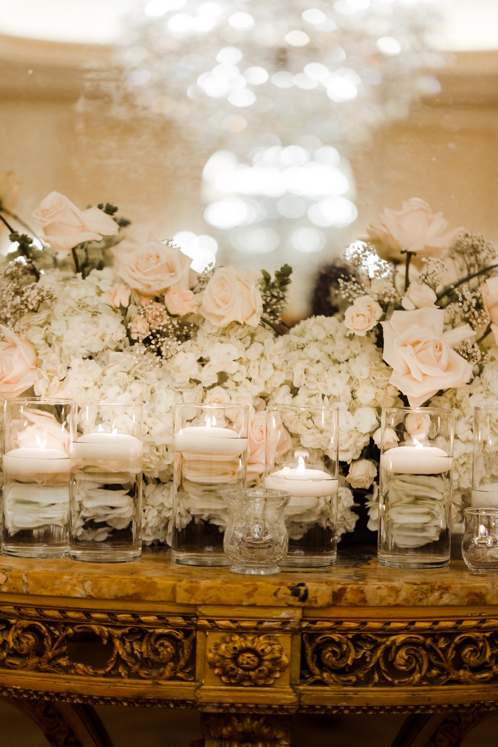
A palette is not a percentage. Assign each color a job: the lead color in bouquets and centerpieces, the supporting color in the bridesmaids’ dresses and ribbon, the accent in the glassware, the menu cards, or one bloom per table, the neutral in the linens and the paper. When every color has a place, the room reads as one idea from the ceremony to the last table.
Do
Tie the men’s attire in with one piece: a tie, a boutonniere, a pocket square in the supporting color.
Don’t
Match the groomsmen to the bridesmaids exactly. It flattens the photographs.
No. 05
Palettes that age well, and ones that don’t
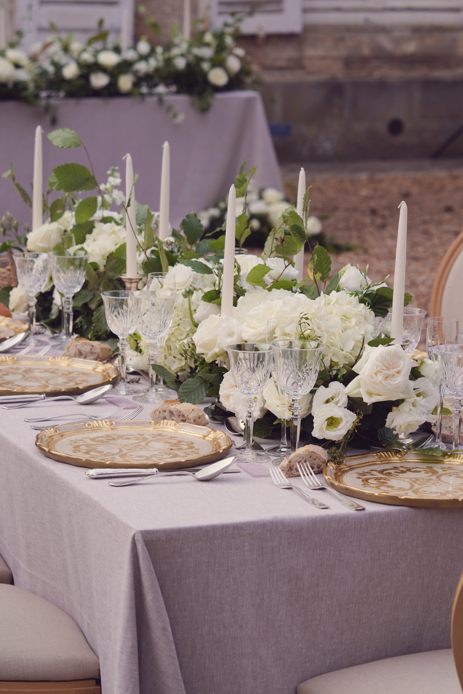
Palettes drawn from the venue and from nature age well: cream and greenery, lavender and dusty blue, terracotta and olive, navy and ivory, blush and taupe. Palettes drawn from a trend age fast: anything neon, anything metallic as a main color, ombré gradients, and all-black-everything in daylight.
The test we use: would this palette make sense in this room if no wedding were happening? If yes, it will still make sense in the album in twenty years.
No. 06
Palettes we have built, and why
Greenery, blues & cream
A Spanish-Mediterranean hotel by the sea. The florals joined the building instead of interrupting it.
Lavender & dusty blue
A modern coastal wedding on the bay, with one fuchsia note at the tables to keep the evening alive.
White, taupe & gold
A private estate. The hardest palette to do well, and the one that lets a garden be the design.
White & green, Cool Water roses
A black-tie ballroom. A single lavender note kept gold and crystal from reading heavy.
If you are stuck, bring us the venue and one photograph you love. We will tell you which of its colors the room will accept, and which one should become the accent.
Bella Mia Exclusive Events
Planning a wedding or event in San Diego and want a second set of eyes on the details?


